Categories
blog works goliath-fallen comics

Making a Graphic Novel: 5 Lessons Learned from Failure

This entry is part [part not set] of 1 in the series Web­comics & Graph­ic Novels

My debut nov­el, GOLIATH FALLEN, has gone through sev­er­al phas­es dur­ing its long, long devel­op­ment his­to­ry. Per­haps the most promi­nent one was the time I ditched the book out­right and tried mak­ing a graph­ic nov­el instead. What trig­gered such a dras­tic mea­sure? Hon­est­ly, burnout was a big part of it. Writ­ing became a lone­ly and slow endeav­or, and I was grow­ing more and more des­per­ate to final­ly get the book published.

This fatigue appar­ent­ly led me to be open to new ideas. The idea of a graph­ic nov­el actu­al­ly stemmed from exter­nal feed­back. A com­mon refrain from my cri­tique part­ners was that my nar­ra­tive style was very “visu­al.” That was the true catalyst.

The idea was sim­ple: if my nar­ra­tive style is so visu­al, it should eas­i­ly trans­late to a graph­ic nov­el. Cre­at­ing it should also be eas­i­er, quick­er, and more seri­al­iz­able than an actu­al nov­el. Truth­ful­ly, I’m still strug­gling to com­pre­hend how such an idea sound­ed even remote­ly rea­son­able at some point.

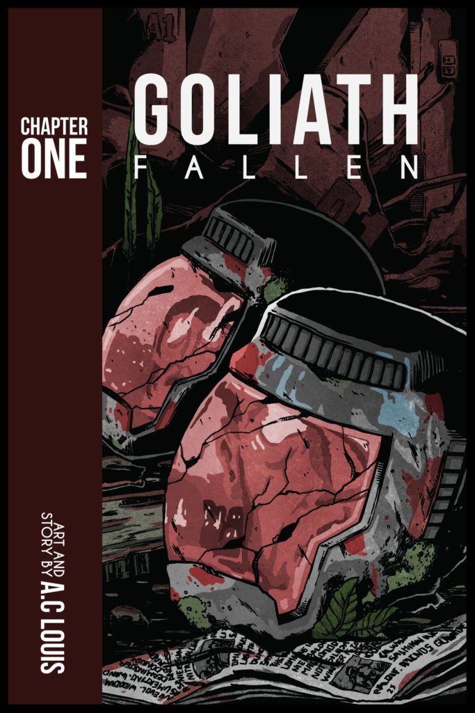
Goliath Fall­en, Chap­ter One cover

Need­less to say, it failed spec­tac­u­lar­ly. I lacked the expe­ri­ence, man­pow­er, dis­ci­pline, and willpow­er to see it through. Sure, I did­n’t have to write thou­sands of words per chap­ter (I could just illus­trate things). But, I still had to write a script and assume oth­er roles like draw­ing, let­ter­ing, and for­mat­ting. I gave up on the endeav­or about two issues and six­ty pages in.

It was a long and wind­ing road of rub­ble I walked bare­foot through until final­ly real­iz­ing that the work­load would end up killing me. And that’s no joke—my health notably declined due to lack of sleep, poor nutri­tion, and a hor­ri­ble work-life bal­ance. If any­thing, this expe­ri­ence only cement­ed my respect for pro­fes­sion­al com­ic book artists. It amazes me that some­one can deliv­er 30-page issues (or even 120-page tomes in the case of man­ga) in the span of a mere month.

While gru­el­ing, the project wasn’t fruit­less. I learned a ton dur­ing that year, and I think some of my insights are worth shar­ing. So, here I bring you my top five lessons learned from try­ing (and fail­ing) at mak­ing a graph­ic novel.

1. Ensure the script is finished

Graph­ic nov­els (and com­ic books) fol­low a script. We don’t just sit down to draw pan­els with­out a clear guide of what’s going to hap­pen. Impro­vis­ing a graph­ic nov­el is buy­ing our­selves a tick­et to Pain City at a dis­count. And that’s if we’re work­ing alone. If we have an artist, they’ll prob­a­bly laugh in our face.

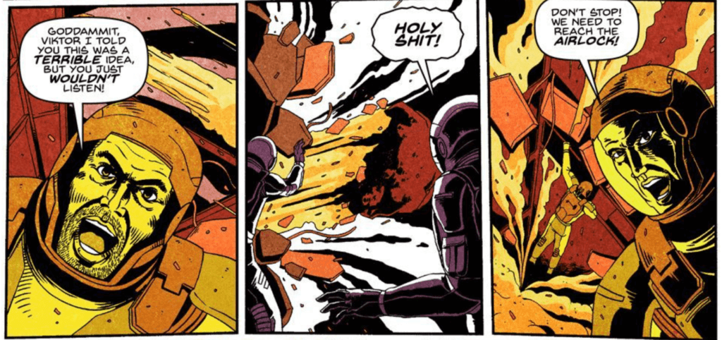
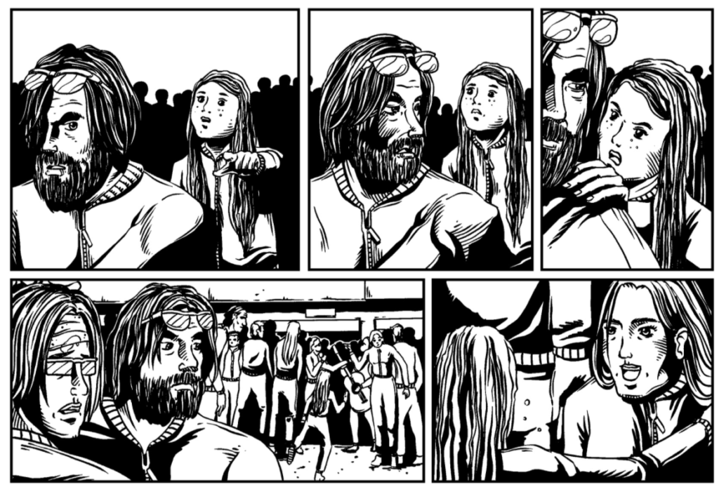
Goliath Fall­en Graph­ic Nov­el (Chap­ter One, The Juno Mission)

Like it or not, every good graph­ic nov­el starts with a fin­ished writ­ten script. And when I say “fin­ished,” I mean fin­ished. That includes edit­ing, revis­ing, proof­read­ing, and every­thing else involved in pub­lish­ing an actu­al book. This is crit­i­cal because if changes are made lat­er on, that means we’ll have to redraw entire pages. If we’re sev­er­al pages in, a change at the begin­ning of the script means we’ll have to throw the entire issue in the garbage and start over.

Trust me—you don’t want to be in that position.

I was but a rook­ie the first time I marked my script “ready to go.” In real­i­ty, it was far from it. Redraw­ing 30 pages is no joke. Plan to spend a rea­son­able amount of time on the script so that it’s air­tight once the draw­ing starts. I know this is espe­cial­ly hard as writ­ers tend to get stuck in edit­ing and rewrit­ing. Take your time, but just remem­ber: the draw­ing starts when the writ­ing stops. In terms of bud­get­ing, redraw­ing pages our­selves will only cost us time (and years off our life expectan­cy). If we’re work­ing with an artist for hire, how­ev­er, redraws will drain our bud­get in a snap.

2. Keep the art style simple

Whether we’re self-pub­lish­ing or work­ing with a tra­di­tion­al house, we’ll always be on a sched­ule. We might even be under a con­tract to meet cer­tain dead­lines. As for me, I was self-pub­lish­ing my nov­el as a web­com­ic and releas­ing pages twice a week.

Build­ing a sus­tained read­er­ship and attract­ing organ­ic traf­fic to a web­com­ic is a lot of work. And those eye­balls can be gone in a flash if the sched­ule isn’t close­ly fol­lowed. Inter­net read­ers in par­tic­u­lar take this very seri­ous­ly. If you’re not suf­fi­cient­ly feed­ing their con­tent diet when they expect it, they’ll move on to one of the thou­sands of oth­er web­comics. In the tra­di­tion­al world, miss­ing dead­lines could be even more con­se­quen­tial (and may even result in a breach of contract).

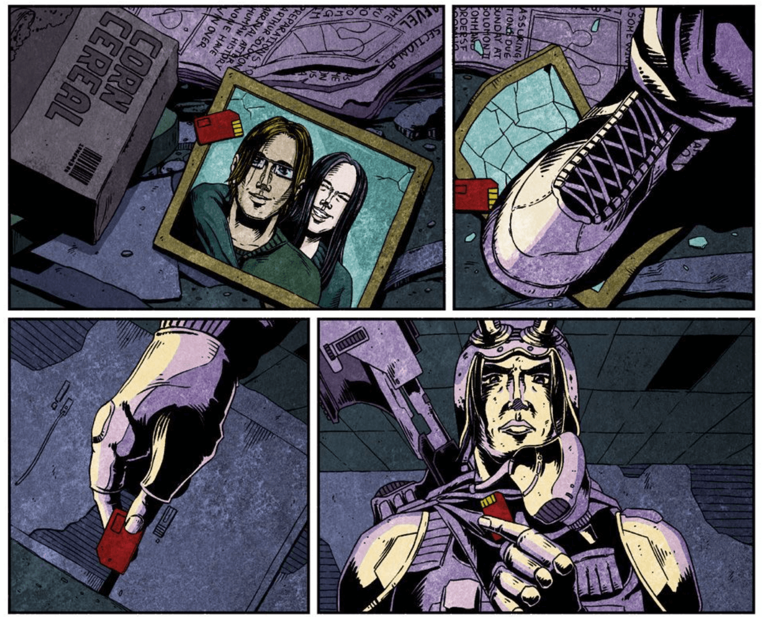
Com­plex, intri­cate art takes time. To opti­mize effi­cien­cy and meet dead­lines (self-imposed or oth­er­wise), it’s best to stick with a sim­ple art style. The style I employed in the graph­ic nov­el ver­sion of Goliath Fall­en was inspired by Dave Gib­bon’s Watch­men illus­tra­tions (and clas­sic Amer­i­can com­ic books in gen­er­al). And while I loved Gibbon’s style, I had­n’t count­ed on it doom­ing my project.

It was sim­ply too elab­o­rate, and my out­put was at most two six-to-eight-pan­el pages a week. Two pages a week! And it heav­i­ly depend­ed on the com­plex­i­ty of the scenes and back­grounds. Even if I released the pages as com­ic strips, I was still churn­ing out too lit­tle con­tent for a whole sev­en days. At that rate, I’d be lucky to fin­ish by my sev­en­ti­eth birth­day (not real­ly, but you get the idea).

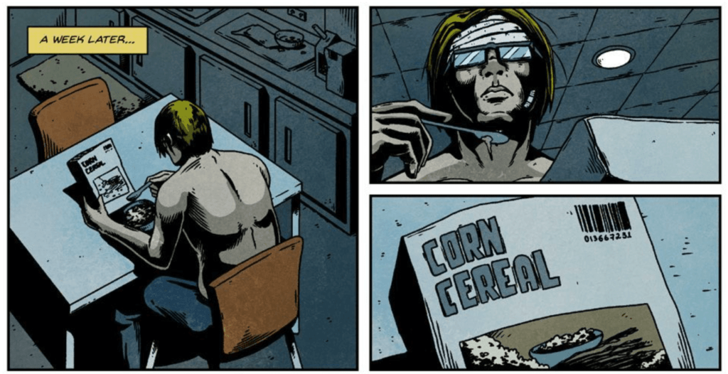
Goliath Fall­en Graph­ic Nov­el (Chap­ter One, Intro)

Remem­ber, it does­n’t mat­ter if it takes a week to draw a page. No mat­ter how much detail or effort is put into it, it will be read in sec­onds by readers.

The truth of the mat­ter is that the art style of our graph­ic nov­el isn’t even that impor­tant. One Punch Man’s orig­i­nal web­com­ic looked like doo­dles on a nap­kin, and yet it still launched into the stratos­phere and gar­nered a seis­mic fol­low­ing. It was lat­er remas­tered into the man­ga we know and love today. The art style did­n’t have to be a mas­ter­piece of con­tem­po­rary art; it only had to be good enough to trans­mit the sto­ry effec­tive­ly. Mean­while, the graph­ic nov­el ver­sion of Goliath Fall­en had a kick­ass art style (if I do say so myself), but it was so hard to pro­duce that I could­n’t keep up. I was work­ing prac­ti­cal­ly 24/7 to pro­duce just two pages a week, which was sim­ply absurd. 

After I quit the project, I read Scott McCloud’s Mak­ing Comics (an essen­tial read), in which he cov­ers this exact issue in depth. If I had a time machine, I would go back and read that book before I even con­sid­ered the idea of a graph­ic nov­el in the first place.

3. Prepare a content buffer

Pos­si­bly the biggest mis­take I made when mak­ing a graph­ic nov­el was not hav­ing a con­tent buffer. I pub­lished pages as I fin­ished them. But, I was aver­ag­ing one or two pages a week, so that should be fine, right? Most def­i­nite­ly not. If life got in the way (and it always does), that meant that I did­n’t have any­thing to post, and I’d miss my upload days. Tak­ing a few days off when I was start­ing to feel burned out was com­plete­ly out of the ques­tion. My read­ers were count­ing on me, and they want­ed to know what was next in the story.

After miss­ing a dead­line, the only way to catch up is to sim­ply find the time and work the nights away. If we don’t make time, work will accu­mu­late until we don’t have a life any­more. We’ll remain pris­on­ers of our own cre­ation (as dra­mat­ic as that might sound).

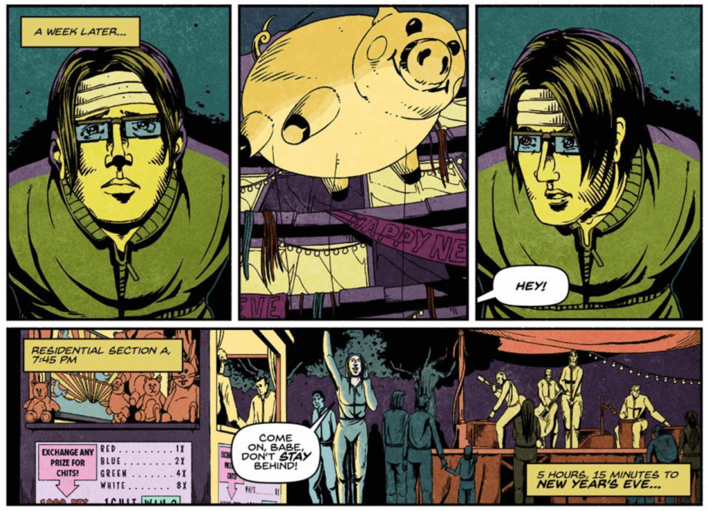
Goliath Fall­en Graph­ic Nov­el (Chap­ter Two, The Fair)

The key take­away here is to always be ahead of sched­ule. Retain three months of con­tent as a  buffer if pos­si­ble. With that much of a buffer, we should be able to con­sis­tent­ly meet our update days even when life gets in the way. The amount of pre­pared con­tent we’ll need will always depend on the type of graph­ic nov­el we’re mak­ing. Just make sure you have enough con­tent to keep your sched­ule steady should the apoc­a­lypse come tomorrow.

4. Don’t go solo; work with a team

The graph­ic nov­el ver­sion of Goliath Fall­en was pro­duced by a team of one. I spent an entire year work­ing all by myself out­lin­ing, script­ing, pen­cil­ing, ink­ing, let­ter­ing, for­mat­ting, and who knows what else. It was an insur­mount­able amount of work, and, admit­ted­ly, I should­n’t have gone at it alone. This was the sec­ond key mis­take (along with my rather intri­cate art style) that end­ed up doom­ing my graph­ic novel.

If resources allow, nev­er go solo. While I can draw, I should’ve teamed up with an artist to do that part for me. That would’ve giv­en me col­lec­tive months of my time back to allow me to focus more on writ­ing. Don’t bite off more than you can chew. While that’s very cliché advice, it’s nonethe­less true.

For nat­ur­al-born illus­tra­tors, relin­quish­ing con­trol over the design process can be tough. There’s a cer­tain pride in see­ing our illus­tra­tions in the graph­ic nov­el that car­ries our name. So while out­sourc­ing may mean that we might not get the glo­ry all to our­selves, it at least gives us the con­fi­dence to know that we have the time to get the work done and fin­ish our graph­ic nov­el. The glo­ry will only come if the project is actu­al­ly fin­ished and released to the world.

Even just hav­ing anoth­er indi­vid­ual to pass ideas by is itself supreme­ly valu­able. We’re more like­ly to wind up with a bet­ter end prod­uct just by receiv­ing this feed­back ear­ly on in the process of writ­ing a graph­ic nov­el. My stub­born­ness, unfor­tu­nate­ly, got the best of me, and I just did every­thing myself. Don’t make the same mis­take I did.

If bud­get is a con­cern, there are some alter­na­tive approach­es you can try. Some graph­ic nov­el authors have found suc­cess in offer­ing to bring on illus­tra­tors as co-authors and share roy­al­ties if it ends up being a hit. Many com­ic book projects work this way. You could also just hire some­one to take your sketch­es and col­orize them (instead of pay­ing them to illus­trate from start to fin­ish). At the very least, a sol­id team should be com­prised of both a writer and an artist.

5. Master your tools

The tools we use to cre­ate our graph­ic nov­el (writ­ing, draw­ing, let­ter­ing, etc.) should be exact­ly that—tools. They’re meant to make our lives eas­i­er, not the oth­er way around. Sure, we can buy expen­sive pro­grams such as Adobe Cre­ative Cloud at a whop­ping $30–50 per month, but if we don’t know how to use them, they’ll only serve to hin­der our graph­ic nov­el process. It’s essen­tial that by the time we com­mit to a plan, we know our tools well. It’s worth­while to spend time learn­ing them.

I’m not say­ing that it’s imper­a­tive to know every sin­gle short­cut there is. That’s not rea­son­able. Aim for a skillset where you at least feel com­fort­able and in con­trol. Less time spent try­ing to con­fig­ure dig­i­tal inks means more time avail­able to actu­al­ly work on our graph­ic novels. 

Always choose a simple art style when making a graphic novel.

Before div­ing into online tuto­ri­als and cheat sheets, start by mak­ing a list of the tools you’ll need. These can include pro­grams for draw­ing, let­ter­ing, and pub­lish­ing. In my case, it was Clip Stu­dio Paint (draw­ing), Adobe Illus­tra­tor (let­ter­ing), and InDe­sign (pub­lish­ing). Once we have our suite estab­lished, then we can start the learn­ing process. There are a num­ber of use­ful pro­grams out there, includ­ing Skill­share and YouTube videos that are sur­pris­ing­ly com­pre­hen­sive. Don’t wait until you’re on a tight dead­line to start read­ing through forums on how to blur col­ors or resize an art­board (like I did). 

Final thoughts

My own year-long graph­ic nov­el jour­ney was one of the most frus­trat­ing peri­ods of my pro­fes­sion­al life. Over that time, I learned there’s a true art in mak­ing a graph­ic novel—and I’m not just refer­ring to the draw­ings inside. Draft­ing a script ahead of time, select­ing the right art style, prepar­ing a con­tent buffer, work­ing with a team, and mas­ter­ing the tools of the trade are just a few con­sid­er­a­tions to ensure a more seam­less and suc­cess­ful project.

Although the graph­ic nov­el ver­sion of Goliath Fall­en doesn’t exist in its entire­ty today, the process was insight­ful and reward­ing. It also forced me to reck­on with my per­son­al weak­ness­es as an author and illus­tra­tor. It is my hope that my unfil­tered per­spec­tive here does­n’t dis­cour­age you. I just want you to avoid the same mis­takes I did and start off your own graph­ic nov­el jour­ney on the right foot. I can attest to the joy of see­ing the fin­ished pages of my own graph­ic nov­el come together.

Giv­en that this project account­ed for a whole year of inten­sive work, I have quite a bit to talk about. I’m con­sid­er­ing writ­ing more about the expe­ri­ence. Let me know what you think. Would you like to hear the whole story?

Get Two Books for Free
Categories
blog writing publishing

Book Cover Design With Award-Winning Illustrator Alejandro Colucci

This entry is part [part not set] of 8 in the series Pub­lish­ing Goliath Fallen

This post is a fol­low-up to a pri­or post in my series about self-pub­lish­ing my debut nov­el, GOLIATH FALLEN, where I detailed the process of find­ing an artist to design the book’s cov­er. The process was both excit­ing and stress­ful as the cov­er is pos­si­bly the most crit­i­cal ele­ment of a book out­side of the descrip­tion. My nov­el must vis­i­bly shine over oth­ers pub­lished by big hous­es with hefty bud­gets and stun­ning, pro­fes­sion­al­ly designed covers.

To fur­ther fuel my anx­i­ety, this was my first expe­ri­ence work­ing with a free­lancer in any capac­i­ty. I did­n’t know the cost of such a ser­vice. Nei­ther how the process worked, or what would hap­pen if I ulti­mate­ly did­n’t like the design. Writ­ing this book has been a long and ardu­ous jour­ney, and I was intent to not screw it up this far in. The stakes (and my blood pres­sure) had nev­er been higher.

I spent untold hours brows­ing through free­lanc­ing sites until I final­ly stum­bled upon Ale­jan­dro Coluc­ci on Reedsy, an online plat­form that con­nects authors and pub­lish­ing free­lancers. It took my dumb self a while to real­ize I had found a leg­end in the world of book cov­er design. Sum­ma­riz­ing his impres­sive tra­jec­to­ry is not an easy task, so I’ll bor­row his bio from his web­site (and tweak it slightly). 

Ale­jan­dro Coluc­ci is an award-win­ning artist based in Lon­don, Unit­ed King­dom. He has illus­trat­ed hun­dreds of fan­ta­sy, crime, hor­ror, his­tor­i­cal fic­tion, and sci­ence fic­tion pub­li­ca­tions across the globe com­mis­sioned by major pub­lish­ers main­ly through­out Europe and the USA. Best-sell­ing authors includ­ing Anne Rice, Robin Hobb, Isaac Asi­mov, Mario Puzo, H.G. Wells, Ursu­la K. Le Guin, Andrzej Sap­kows­ki, William Gib­son, Steven Erik­son, Robert Louis Steven­son, and J.G. Bal­lard, to name a few, show­case Ale­jan­dro’s illus­tra­tions in their books. He’s also known for design­ing the orig­i­nal cov­ers of The Witch­er series.

With such a track record, you might guess that the quote for his design ser­vices was very much at the top end of my bud­get. And you’d be cor­rect. How­ev­er, after wit­ness­ing Ale­jan­dro’s stun­ning art, I was deter­mined to work with him. In the end, I signed him up, con­fi­dent my new cov­er would come out spec­tac­u­lar­ly and win over the eyes of prospec­tive read­ers. This post recounts my expe­ri­ence work­ing with this award-win­ning illustrator.

The project and preliminary discussions

Before I could work with Ale­jan­dro, Reedsy asked me for my book’s basic info: title, sub­ti­tle, genre, and char­ac­ters. I also attached the orig­i­nal, first-con­cept cov­er of GOLIATH FALLEN as a ref­er­ence in the brief. Once the project start­ed, the site allowed me to mes­sage Ale­jan­dro direct­ly in order to dis­cuss more specifics.

I had a vision for this cov­er from the get-go, which I detailed as much as pos­si­ble in order to give him bet­ter guid­ance. To be clear, this was­n’t under any cir­cum­stances an attempt to seize cre­ative con­trol from him; it would be ludi­crous to hire a stel­lar artist only to have them do it my way. I sim­ply want­ed to pro­vide an over­ar­ch­ing direc­tion to fol­low. We talked about my vision, but I also made it super clear to take many of my ideas with a big grain of salt.

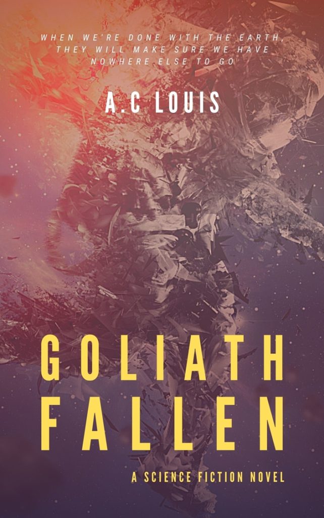
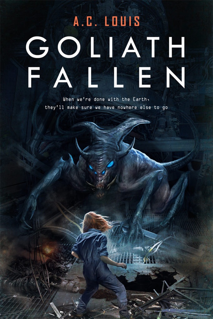
Goliath Fal­l­en’s orig­i­nal, first-con­cept cov­er with art by @naked.monkey

My first idea was to design some­thing along the lines of my orig­i­nal cov­er. In my hum­ble opin­ion, it does a good job cap­tur­ing the mood of my sto­ry: iso­la­tion, destruc­tion, and chaos. How­ev­er, giv­en that I had a pro­fes­sion­al now, I was open to tak­ing the design in a com­plete­ly dif­fer­ent direc­tion. At this stage, design­ing some­thing sim­i­lar to the orig­i­nal cov­er would be a fruit­less endeav­or. I want­ed to see what was pos­si­ble to real­ly have GOLIATH FALLEN stand out on the shelves.

My sec­ond idea for the design was moti­vat­ed by feed­back from my beta read­ers. They often com­ment­ed that their favorite char­ac­ter from my book was Izzy Clarke, a tena­cious 12-year-old girl who dwells with her father in the wreck­age of the star­ship Goliath. At the begin­ning of the sec­ond act, Izzy con­fronts a howler, a vicious alien crea­ture resem­bling a tailed rep­til­ian bull. In imag­in­ing that scene, I always pic­tured some­thing akin to the “Fear­less Girl” and “Charg­ing Bull” sculp­tures near New York’s Wall Street. For the cov­er, I thought it would be a great visu­al to have Izzy and the howler stand­ing off in a sim­i­lar fash­ion with the post-apoc­a­lyp­tic inte­ri­or of the Goliath in the background.

Fear­less Girl and Charg­ing Bull sculp­tures near New York’s Wall Street

When I pre­sent­ed both ideas to Ale­jan­dro, he advised that we go with the sec­ond one since it’ll allow us to show­case the char­ac­ters more effec­tive­ly. At this stage, we were just start­ing pre­lim­i­nary dis­cus­sions before Ale­jan­dro got to work on the cov­er a month lat­er (at my request).

Sketching the general direction of the book cover design

Once we set­tled on a gen­er­al direc­tion, I decid­ed to devel­op a very rough sketch to ensure Ale­jan­dro and I had a com­plete mutu­al agree­ment on the path we were tak­ing with the design. I found it impor­tant to set this cre­ative direc­tion upfront because Alejandro’s design would­n’t com­prise a com­po­si­tion of stock assets or images but a dig­i­tal col­lage mix­ing pho­tos, tex­tures, and dig­i­tal paint­ing. All this to say that if changes were required once the art­work was done, he would have to redo the entire thing (or at least a good por­tion of it).

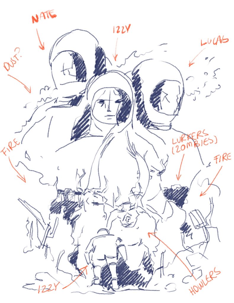
My rough, very bloat­ed cov­er sketch

In ret­ro­spect, I end­ed up com­plete­ly over­do­ing the sketch. I added the ele­ments that I con­sid­ered to be cen­tral to the sto­ry: the main char­ac­ters, the crea­tures, and the set­ting. In the fore­ground, we have Izzy con­fronting not one but two howlers (like the actu­al scene in the book). There’s fire and rub­ble on the sides and behind the sil­hou­ettes of lurk­ers, which are zom­bie-like crea­tures. Final­ly, in the back­ground, we have a clas­sic float­ing-heads arrange­ment fea­tur­ing the three main char­ac­ters: Izzy, her father, Nate, and sci­en­tist Lucas Sund­berg all in space­suits for some reason.

While Ale­jan­dro will ulti­mate­ly be the cre­ative direc­tor, these char­ac­ters, crea­tures, set­ting, and oth­er sto­ry ele­ments are described in a cer­tain way in the book that the final cov­er design will have to fol­low. For this rea­son, in addi­tion to the sketch, I wrote a brief con­tain­ing descrip­tions and ref­er­ence images. I uploaded every­thing to Reedsy and sent it over to him for com­ment. All along, I felt like maybe I was get­ting too much in the way of his cre­ative process. I didn’t want to sti­fle him. How­ev­er, once he replied, I was pleas­ant­ly sur­prised by how recep­tive he was.

Refining the book cover design

A pro­fes­sion­al artist with tons of expe­ri­ence doesn’t only pro­vide you with a high-qual­i­ty book cov­er. They can also chis­el your vision into some­thing that can tru­ly suc­ceed in the mar­ket. Ale­jan­dro has designed stun­ning cov­ers for dozens of suc­cess­ful books. Nat­u­ral­ly, he knows this indus­try far bet­ter than I do. His ver­dict on my sketch was that it was too busy and looked like a cliché movie poster. He is very polite and pro­fes­sion­al, so he did­n’t exact­ly use those words, but, in essence, that was his feed­back. And, hon­est­ly, I could­n’t agree more.

Amongst a dozen oth­er things, I had for­got­ten to leave space for the book title. And also, the sub­ti­tle, and my own name as the author. It would appear to me (and any­one half awake) that these are cru­cial ele­ments in a book cov­er. With my sketch, if we added any let­ter­ing at the top, it would have cov­ered the back­ground char­ac­ters entire­ly. What was I thinking?

Ale­jan­dro end­ed up sug­gest­ing a more sim­pli­fied com­po­si­tion with only Izzy fac­ing the howler. The scene itself is pret­ty pow­er­ful already and far more intrigu­ing than a bunch of float­ing heads. This would also be eas­i­er on the viewer’s eyes and leave plen­ty of room to play with lettering.

The book cover design reveal (and iterations)

Once we visu­al­ly com­mit­ted to the direc­tion, it was time for Ale­jan­dro to start the hard work of illus­trat­ing the book cov­er design. At this stage, my anx­i­ety was cer­tain­ly get­ting the best of me. I was con­fi­dent in Ale­jan­dro and his incred­i­ble skills, but I’d been work­ing on this book for six long years, and this was a big moment. On top of all that, Ale­jan­dro would have the cov­er ready in just one week. One week! My gosh… stop­ping to catch a breath is not an option in the self-pub­lish­ing world.

First iteration

As expect­ed, the fol­low­ing week flew by. Before I knew it, I had Ale­jan­dro back in my inbox with the first iter­a­tion of my book’s cov­er design. I had just wok­en up (Ale­jan­dro is sev­en hours ahead of me), and Reedsy’s noti­fi­ca­tion shot my heart rate up to a thou­sand. I couldn’t bring myself to open the attached image until lat­er in the day since I need­ed time to men­tal­ly pre­pare myself for this moment. But, at last, when I gath­ered the courage, I was final­ly able to fath­om the true mag­ni­tude of Alejandro’s talent.

Goliath Fal­l­en’s book cov­er (first version)

I sim­ply can­not describe what I felt when I first saw this book cov­er design (which doesn’t speak too well of me as a writer but bear with me here). It was as if Ale­jan­dro had reached into my brain and pulled Izzy out of it and put her on the page. Also, he was absolute­ly right; hav­ing only the scene of Izzy fac­ing the crea­ture makes the visu­al come alive. It’s a more sound, well-bal­anced, and provoca­tive design.

After get­ting over the ini­tial shock, I did the same thing I always do with a com­plet­ed man­u­script: I put the cov­er away for a bit with the inten­tion to revis­it it lat­er with a cool­er head. That way, I would see it with a fresh perspective.

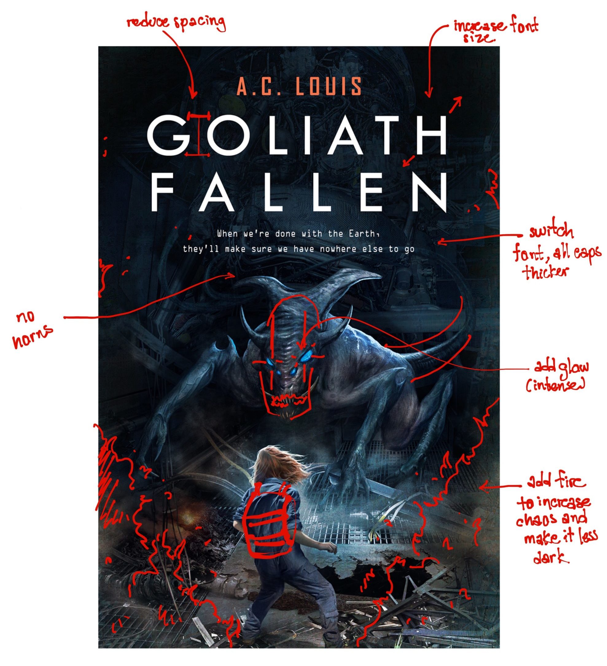
The next day, I gave the cov­er a clos­er inspec­tion. I noticed a few minor details that need­ed some work, like the title font being a bit too thin and Izzy miss­ing her char­ac­ter­is­tic back­pack. But, what wor­ried me the most was the crea­ture design; it wasn’t accu­rate to how they’re described in the book. Howlers are sim­i­lar to the scream­ing bear from Anni­hi­la­tion but more mus­cu­lar and thin­ner for faster move­ment. My anx­i­ety kicked back in just at the thought of Ale­jan­dro hav­ing to redraw the crea­ture. I felt like that annoy­ing cus­tomer (and no one wants to be that guy).

Any­way, if I was going to ask Ale­jan­dro to rework the cov­er, I would do my best to com­mu­ni­cate the changes to avoid giv­ing him more work than nec­es­sary. In the end, it’s a col­lab­o­ra­tion. The eas­i­er I make his job, the bet­ter the final prod­uct will be and the more it will align clos­er to my vision. And so, I took the lib­er­ty to anno­tate his cover.

Goliath Fal­l­en’s book cov­er (first ver­sion, annotated)

In my response to Ale­jan­dro, I detailed the request­ed changes to the crea­ture as thor­ough­ly as I could. Feel­ing like the most annoy­ing per­son in the world, I uploaded every­thing and hit send.

He answered the next day, leav­ing me once again speech­less with how recep­tive he was. We dis­cussed the crea­ture design and the request­ed changes a bit more, and he asked for a few addi­tion­al days to com­plete the new design. That lev­el of qual­i­ty was worth wait­ing for. He could have tak­en the whole month for all I cared.

Second iteration

About a week went by before Ale­jan­dro returned an updat­ed design. For me, it felt like two days at most—he works fast, and I couldn’t even bear it. Again, I need­ed to take a few hours before view­ing the new design. If I was stoked with the first ver­sion, this new one had me twice as pumped.

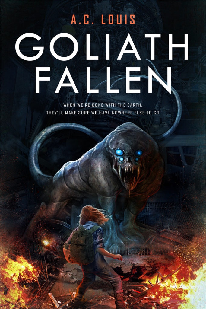
Goliath Fal­l­en’s book cov­er (sec­ond version)

From my per­spec­tive, the addi­tion of the fire in this new design ben­e­fit­ed the over­all com­po­si­tion by revving up the sense of urgency. It also helped bet­ter ori­ent the viewer’s atten­tion. With the low­er por­tion now more strik­ing, Izzy becomes the pri­ma­ry focus. We then have the title and, last­ly, the crea­ture. Izzy’s back­pack is also in there, which is the rea­son she’s fac­ing that crea­ture in the first place. In the nov­el, she goes out on a sup­ply run where she found it and gets ambushed by howlers.

As for the let­ter­ing, the book title now looks more robust, and the sub­ti­tle font com­ple­ments the visu­al theme bet­ter. The over­all design looks more “sci-fi”. Before we start­ed the project, Ale­jan­dro point­ed out that although his spe­cial­ty was fan­ta­sy cov­ers, he would try his best to design a sci-fi one. How­ev­er, one of the main rea­sons I picked him for this job is that my book is full of crea­tures and oth­er “fan­tas­ti­cal” sci-fi ele­ments, so I need­ed some­one with expe­ri­ence ren­der­ing such onto a canvas.

At last, we have the howler in the back­ground, now com­plete­ly redesigned. I had request­ed Ale­jan­dro to leave the long tail, make the eyes brighter, and change the body from some­thing resem­bling an insect to a more bull-like crea­ture. How­ev­er, while I was as stoked for this book cov­er design as ever, some­thing still did­n’t feel right. The howler’s face was per­fect, but its pos­ture and body type still did­n’t resem­ble my idea of a howler. For starters, they’re not as bulky. They’re huge and heavy but also sneaky, prowl­ing in the dark­ness around their vic­tims. The rest of the cov­er was per­fect, but the crea­ture still need­ed work.

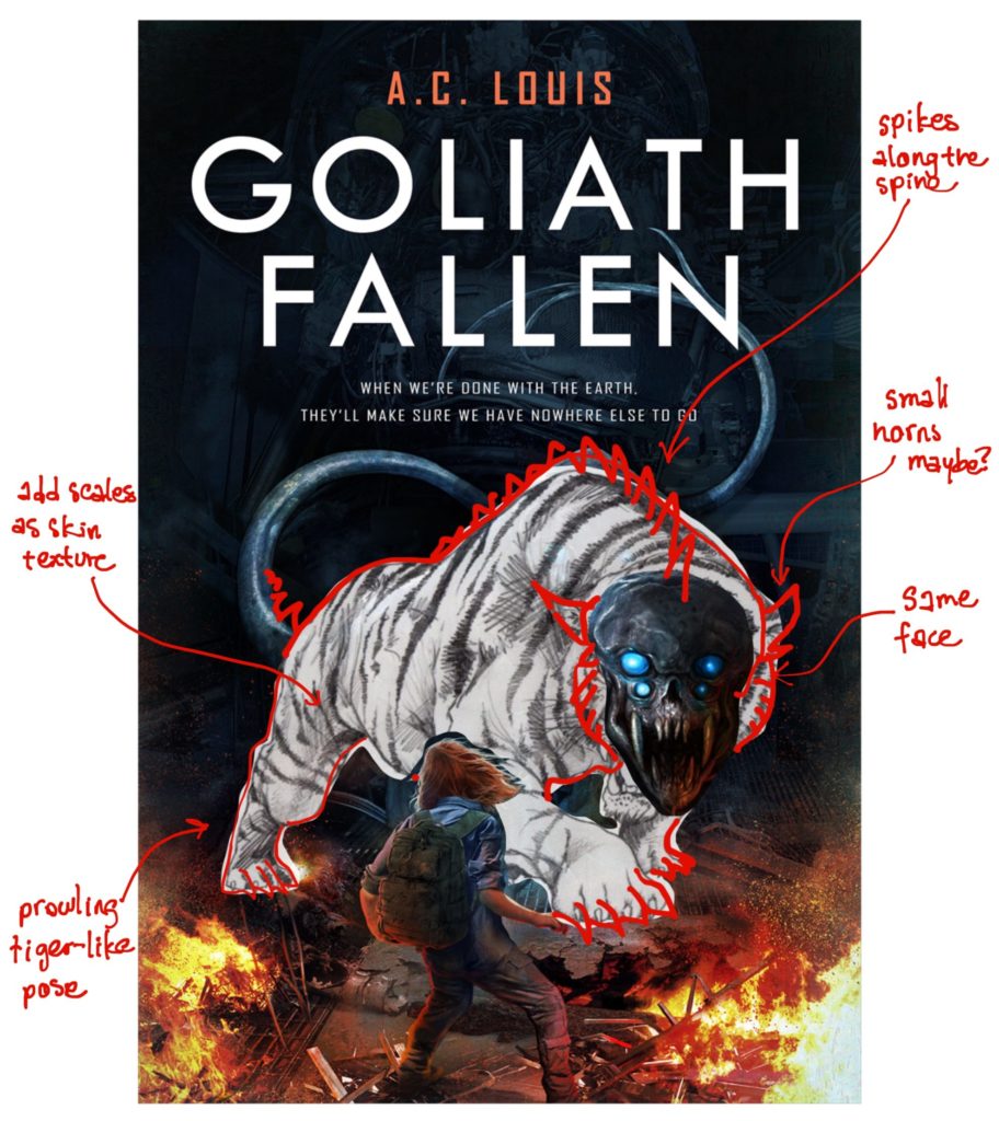
I real­ized I would have to request that Ale­jan­dro make addi­tion­al changes, and the dread start­ed to con­sume my soul. In any case, my inten­tion was to reach out to him, and if redo­ing the howler was too much work, then I would at least have this incred­i­ble cov­er that I could eas­i­ly use. Like the last time, I anno­tat­ed the cov­er design instead of just bom­bard­ing him with a list of changes. After all, that approach had worked well before.

Goliath Fal­l­en’s book cov­er (sec­ond ver­sion, annotated)

Once again, I felt like I was seiz­ing cre­ative con­trol, but there wasn’t real­ly a way around it as my howlers have a very spe­cif­ic look. I had to make my vision clear. I also thought that a prowl­ing lion pose would make the crea­ture appear more men­ac­ing. If I had to pick an icon­ic scene from my book, this would be it! I want­ed the cov­er to accu­rate­ly bring it to life.

And so, while Ale­jan­dro expressed that redraw­ing the crea­ture was a great deal of work, he was com­mit­ted to full cus­tomer sat­is­fac­tion. At this point, it felt more like he was chal­leng­ing him­self to nail down the howler design. With­out fur­ther com­ment, he reced­ed back into his stu­dio to redo the cov­er. This man seri­ous­ly is a god­send. For my first time work­ing with a free­lancer, this has been an exceed­ing­ly sat­is­fy­ing expe­ri­ence. I was con­fi­dent in Alejandro’s skills and that the next iter­a­tion would be perfect.

Third (and final) iteration

Alejandro’s next deliv­ery was my def­i­n­i­tion of per­fec­tion. I hon­est­ly have no words to this day to describe how impressed I am with this cov­er. All I can say is that a big smile drew on my sil­ly face when I first laid eyes on it. Take a look for your­self at Goliath Fallen’s third and final cover:

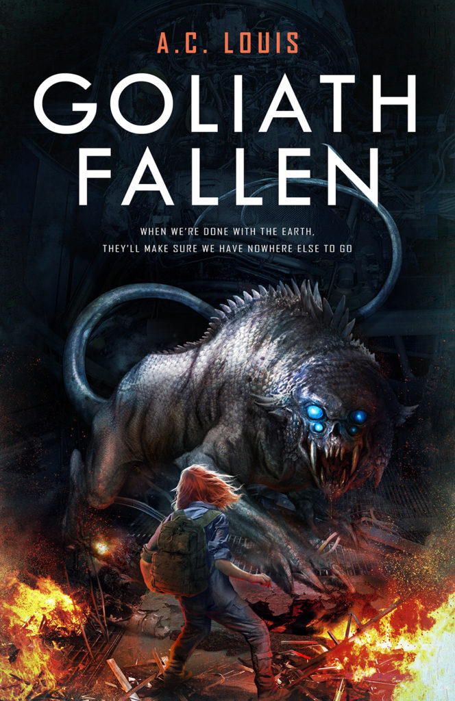
Goliath Fal­l­en’s new book cover

One word comes to mind when I see this ver­sion of the howler: men­ac­ing. The long tail, the scaled skin, the heavy but nim­ble-look­ing body, the ter­ri­fy­ing four-eyed face with blood drip­ping down a mouth full of fangs—this is exact­ly what howlers look like. How the heck will Izzy be able to get out of this? That’s pre­cise­ly the ques­tion I want to evoke in the read­ers’ minds. 

Just look­ing at this cov­er, I com­plete­ly for­got about how much it cost. I was extreme­ly sat­is­fied, and, more­over, I was glad to know that Ale­jan­dro was as well. I’ll just quote him here:

This is one of my favourite sci fi book cov­ers I made this year, by the way.

I felt ter­ri­ble about mak­ing him redo the cov­er so many times, but this com­ment reas­sured me. We were a team, and we both need­ed to be sat­is­fied with the end prod­uct. That’s an impor­tant take­away I got from all of this (aside from a kick­ass cov­er I can’t wait to use everywhere).

Final thoughts

Design­ing the book cov­er for my debut nov­el, GOLIATH FALLEN, has been one of the most excit­ing expe­ri­ences I’ve had to date. Just imag­in­ing my book sit­ting there on shelves with this incred­i­ble cov­er sends chills down my spine. I was incred­i­bly lucky to get to work with some­body as tal­ent­ed, pro­fes­sion­al, and com­mit­ted as Ale­jan­dro Coluc­ci. I can’t thank him enough for all his hard work and end­less patience. Hope­ful­ly, this hum­ble piece serves as a spe­cial, very well-deserved “thank you.”

As a final note, if you’re look­ing for an incred­i­ble design­er to bring your fan­ta­sy or sci-fi book cov­er to life, don’t hes­i­tate to reach Ale­jan­dro over on Reedsy or on his web­site. Let my new, blaz­ing-hot cov­er be a tes­ti­mo­ny to his end­less tal­ent. If any­thing, Ale­jan­dro has left the bar impos­si­bly high, and I can’t imag­ine myself work­ing with any­body else for future writ­ing projects.

I hope you enjoyed read­ing through the process of work­ing with a free­lancer to design my book cov­er. For me, find­ing the right design­er to work with was imper­a­tive, and I’d be curi­ous to know if any oth­er authors out there found that to be true as well. Let me know in the com­ments below. I’d also love to hear your thoughts on the new book cov­er design too. And, as always, if you have any spe­cif­ic ques­tions, please feel free to reach out.

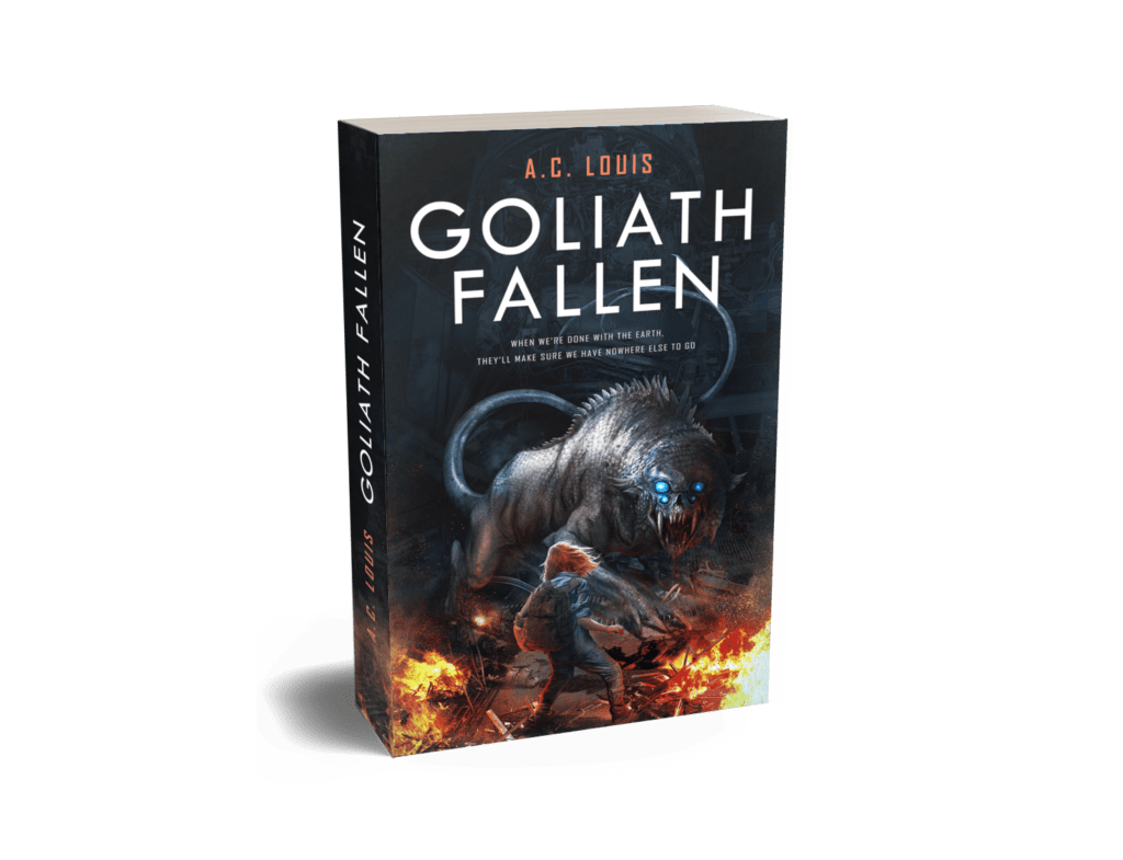
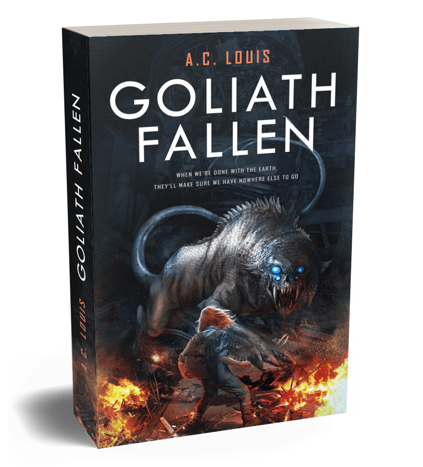
Before we part, I’ll leave you with a ren­der­ing of how Goliath Fallen’s paper­back will appear in its full form. I’m gid­dy with excite­ment over it, and I just can’t not share it!

Get Two Books for Free

Categories
publishing blog writing

Budgeting for my self-published book (update)

This entry is part [part not set] of 8 in the series Pub­lish­ing Goliath Fallen

Wel­come to anoth­er entry in my series on self-pub­lish­ing my debut nov­el, GOLIATH FALLEN! If you haven’t been fol­low­ing along, I pre­vi­ous­ly doc­u­ment­ed my ini­tial efforts to assem­ble the crew that will take my book from a mod­est draft to a best­seller list. This team includes the cov­er artist, book edi­tor, and book descrip­tion writer.

Truth be told, it’s turned out amaz­ing so far. I’ve got­ten to know these incred­i­bly tal­ent­ed indi­vid­u­als who I would­n’t have oth­er­wise met if I had tak­en the more tra­di­tion­al route. How­ev­er, it’s also been an insane amount of work (almost as much as writ­ing the book itself). I’ve read quite a bit about how tax­ing the self-pub­lish­ing process is, and I’m here to tell you it’s all true. The deep­er I dive into this process, the more it feels like writ­ing my nov­el is tru­ly only half the battle.

Up to this point, the hard­est part of self-pub­lish­ing was fig­ur­ing out exact­ly what I need­ed from my team and appro­pri­ate­ly deter­min­ing and allo­cat­ing the bud­get for my self-pub­lished book. Not only was this tough, but it was also crit­i­cal as my bud­get deter­mines whether I’ll spend all my resources (mon­ey and time in this case) effec­tive­ly or not.

At last, with my crew com­plete and now hard at work, it’s time to fol­low up on my pre­vi­ous post on budgeting.

Mon­ey on my mind, but not in my wallet

Revisiting the initial budget

While my first bud­get was quite con­ser­v­a­tive, I used price ranges for some ser­vices (like book edit­ing) to keep things some­what real­is­tic. After all, when you keep expec­ta­tions low, it’s like mon­ey in your pock­et when things work out in your favor. I’m look­ing to self-pub­lish a nov­el indis­tin­guish­able in qual­i­ty from one that’s tra­di­tion­al­ly pub­lished, and I can expect that to cost a pret­ty pen­ny. In devel­op­ing this bud­get, I feel like I’ll be burn­ing through the equiv­a­lent of an advance a pub­lish­er would give me…except the pub­lish­er is me.

Any­way, there’s no time to lick my wounds. With­out fur­ther ado, here was my ini­tial budget:

Ser­vice
Cost
Copy edit­ing
$2,750 – $5,500
Cov­er design
$350 – $800
Book descrip­tion writing
$350
Total
$3,900 – $6,300

I real­ize that bud­get­ing for my self-pub­lished book in the range of $3,900 – $6,300 may appear odd. It’s a very, very wide range, which might seem like cheat­ing. But, real­is­ti­cal­ly speak­ing, there’s no way in hell I can afford to pay $6,300 to self-pub­lish my book.

If that’s the price tag I would have to set­tle for, I would rather get myself stuck for a few years in the tra­di­tion­al pub­lish­ing cycle until some­body picks up my nov­el. Let me also clar­i­fy that while I have already decid­ed to self-pub­lish, this is a jour­ney, and noth­ing is set in stone. I might even get to the end of it and choose to not pub­lish my nov­el at all. If any­thing, that might be the biggest plot twist of this whole process (and per­haps an even more com­pelling one than the plot twist in my nov­el itself).

The revised budget

Thank­ful­ly, after some con­ster­na­tion over my ini­tial esti­mates, I’m glad to report that assem­bling my pub­lish­ing crew went a lot bet­ter than I expect­ed bud­get-wise. It only required patient and care­ful analy­sis of each option until I deter­mined the best one for the job.

The book cov­er design still went over my ini­tial esti­mate, but my mind was set on Ale­jan­dro Coluc­ci, and the more bud­get-friend­ly alter­na­tives sim­ply did­n’t seize my atten­tion the way his impres­sive art did. Speak­ing of which, I’d like to pro­vide a lit­tle dis­claimer before mov­ing on: Ale­jan­dro’s rate was­n’t pub­licly avail­able, which makes com­plete sense giv­en how the price of the cov­er art depends heav­i­ly on the com­plex­i­ty of what’s required. There­fore, out of respect for him and my read­ers, I’ll use an approx­i­ma­tion for the cov­er art design estimate.

Here’s the revised budget:

Ser­vice
Free­lancer
Cost
Copy edit­ing
$2,750
Cov­er design
+$1,000
Book descrip­tion writing
$297
Total
+$4,047

I have to admit, those fig­ures are look­ing a lot bet­ter than I ini­tial­ly thought! The revised bud­get is a tad over the low­er range of my esti­mate, but it’s not bad for what was such a loose range. Of course, $4,000 is still a decent chunk of change, but I’m work­ing with a stel­lar crew who could’ve eas­i­ly cost me a lot more than the upper range of my ini­tial budget.

As always, these fig­ures are still sub­ject to change as sit­u­a­tions out­side of my con­trol may arise (like some­one being unable to work, requir­ing a back­fill), or per­haps I’ll need to add more ser­vices along the way. If there’s one thing I can con­fi­dent­ly pre­dict, it’s that some­thing unpre­dictable is like­ly to hap­pen in this process.

Final thoughts

And that’s it for this update on bud­get­ing for my self-pub­lished book. While my ini­tial bud­get was pret­ty loose on the esti­mates, I’m thank­ful to be on firmer foot­ing now that my self-pub­lish­ing crew has start­ed work­ing. And although I’ll still end up shelling out a good num­ber of Ben­jamins, I’m sure it’ll all be worth it once I’m able to lay eyes on the fin­ished product.

I’m still fig­ur­ing out what my next post will be about—maybe my expe­ri­ence work­ing with these fine folks, which I sim­ply can­not look for­ward to enough over this journey.

Hope­ful­ly, this has been an inter­est­ing inside look into the self-pub­lish­ing process and all of its joys and per­ils. As always, feel free to leave your thoughts in the com­ments below; they’re very much appre­ci­at­ed! Have you ever had to deal with bud­get­ing for a self-pub­lished book? How was the expe­ri­ence for you?

Stay tuned for the next post in the series!

Get Two Books for Free

Categories
blog writing publishing works goliath-fallen

How Self-Publishing on a Budget Made Me Write a Better Book

This entry is part [part not set] of 8 in the series Pub­lish­ing Goliath Fallen

I recent­ly real­ized that my post about find­ing an edi­tor for my nov­el, GOLIATH FALLEN, had skipped a cru­cial ele­ment of the jour­ney: the fact that self-pub­lish­ing on a bud­get helped me cut a third of my man­u­script, which, unex­pect­ed­ly, result­ed in a bet­ter book. 

Edi­tors com­mon­ly charge by page or word count. As a result, total edit­ing costs will depend on the length of the man­u­script. With my book clock­ing in at a whop­ping 92,500 words, I’m fac­ing edit­ing costs of $2,700 at a mod­est $0.03 per word. How­ev­er, my nov­el was­n’t always that length. It used to be a mind-bog­gling 150,000+ words. The new­ly reduced length was the result of a four-month rewrite cam­paign after real­iz­ing that hir­ing an edi­tor would have cost me a kid­ney. The cheap­est quote I received based on the orig­i­nal draft was $4,500. And if I want­ed devel­op­men­tal edit­ing, that would’ve run a whop­ping $9,000, which is triple my ini­tial esti­mate and sev­er­al months’ worth of rent where I live (Cos­ta Rica.)

I was between a rock and a hard place, and the only way out was a painful one. After six years of writ­ing and declar­ing my draft com­plete, I had no choice but to dive back in and “make it shorter.”

Pictured: me editing my manuscript during "The Big Rewrite."
Pic­tured: me edit­ing my book dur­ing “The Big Rewrite.”

Finishing the book is only the beginning

“Make it short­er” sounds like a vague, unac­tion­able thing a pub­lish­er would tell you after review­ing the phone book you just wrote. It leaves you with absolute­ly no clue where to start. It’s a frus­trat­ing real­iza­tion to have after you fin­ish writ­ing your book. Real­is­ti­cal­ly speak­ing, how­ev­er, a debut nov­el of such dimen­sions also has an abysmal chance of get­ting pub­lished. I might also seem like I’m self-pub­lish­ing because no agents would take my nov­el. I haven’t seri­ous­ly queried this book yet, so I can’t say that’s the case.

Some fel­low writ­ers might relate to my plight here. I was forced to revis­it the beloved man­u­script I had been writ­ing for years and trim not only a few sen­tences but cut entire scenes, reor­ga­nize or remove chap­ters, or even take out char­ac­ters com­plete­ly. They said self-pub­lish­ing on a bud­get was hard, but this was sim­ply soul-crushing.

Pic­ture me sit­ting at my desk, hands on my head, look­ing down in despair, sweat­ing from this dread­ful real­iza­tion, and try­ing to find a way out of this inescapable abyss. Dra­mat­ic? Yes. Accu­rate? Also yes. I had been writ­ing for so long and was so excit­ed to get this book out. But now, how long would it be before it’s tru­ly ready?

Tough feedback is the best kind of feedback

One day, I shared this real­iza­tion that my book need­ed trim­ming with one of my most trust­ed beta read­ers. As it turns out, she already had the same con­sid­er­a­tion, but it was hard for her to put it into con­cise, action­able feed­back. One point she men­tioned was my overuse of char­ac­ter reac­tions between dia­logue. After some self-intro­spec­tion, I real­ized I do this uncon­scious­ly because I write as if I was watch­ing a movie. This beta read­er hint­ed that I could eas­i­ly remove all that fluff with­out alter­ing the end prod­uct. I re-read the first chap­ters to con­firm her real­iza­tion and found plen­ty of pas­sages like the following:

“Is… is that it?” Casper stut­tered.
Vik­tor could almost hear the rusty cogs of his brain crunch­ing, pro­cess­ing the sit­u­a­tion. A sen­tence left his mouth by its own will: “Go. Wake up the others.”

That pas­sage is way longer than it needs to be. It’s rid­dled with descrip­tions that don’t add enough to jus­ti­fy their exis­tence. Instead, it could be eas­i­ly rewrit­ten to some­thing like:

“Is—is that it?” Casper said.
Vik­tor froze, his mind rac­ing. “Go. Wake up the others.”

This revised pas­sage is clean­er, crisper, and about 20 words few­er. With a few sim­ple changes, it’s easy to see how I could work my way through my man­u­script to trim the edges with­out los­ing integrity.

Around the time my man­u­script was avail­able to beta read­ers, I also received crit­i­cal feed­back from my peers at the NYC Writ­ers Cri­tique Group. Specif­i­cal­ly, one mem­ber said, “I’m 30,000 words in, and not a lot has hap­pened”. I had­n’t under­stood what they meant ini­tial­ly, but they were right nonethe­less. This real­iza­tion was a big pill to swallow—a big pill of hard, cold truth. 

And so, with this fresh per­spec­tive, I sailed off into a long, long jour­ney. I start­ed by read­ing my entire man­u­script yet again. But this time, I read it not as a writer but as a read­er. My fel­low writ­ers know how hard it is to swap your frame of ref­er­ence like that. How do you detach from your cre­ation in order to objec­tive­ly read it like just anoth­er book? For me, it was a three-step process:

  1. Put the book away for a month.
  2. Re-read the entire book, but force myself not to edit a sin­gle word.
  3. Put the book away for anoth­er month.

The sec­ond step is the def­i­n­i­tion of tor­ture. If I had read my book right from the word edi­tor, I don’t think I could’ve resist­ed the temp­ta­tion to edit it. With this in mind, I export­ed it as a PDF so that I could­n’t edit it but could add com­ments in bouts of weakness.

How self-publishing on a budget improved my manuscript

On that last read-through of my book, my fresh eyes did­n’t only catch an exor­bi­tant amount of fluff but they also dis­cov­ered plen­ty of unnec­es­sary descrip­tions, triv­ial dia­logue, and scenes that need­ed to either be trimmed or cut out alto­geth­er. Not even two chap­ters in, I start­ed get­ting “writer’s itch,” or that uncon­trol­lable urge to get down to edit­ing. I cursed that pesky, read-only PDF more times than I could count. But once I was done read­ing, I stuck to the plan and put my book away before a mon­th’s long vaca­tion in order to detox.

When the time came to get back to work, that last edit­ing pass turned into a full rewrite as my hun­dreds of com­ments in the PDF had fore­cast­ed. It took three months to parse through the entire text, and by the end, my man­u­script was an entire­ly dif­fer­ent beast (and 58,000 words lean­er). The pac­ing of the nar­ra­tive ben­e­fit­ed the most from this, result­ing in bet­ter tran­si­tions between dia­logue and action scenes. My proud­est moment was prun­ing the intro­duc­to­ry arc to four chap­ters instead of five, or 8,600 words instead of 18,000. It’s sup­posed to be an intro­duc­to­ry arc, not a novella.

Final thoughts

After star­ing down the bar­rel of thou­sands of dol­lars in poten­tial edit­ing costs, I was forced to take a sec­ond look at my debut nov­el. Armed with crit­i­cal feed­back from read­ers and fel­low writ­ers, I embarked on a four-month-long jour­ney deep into my char­ac­ters, plot­line, and chap­ters. Despite the ini­tial despair and frus­tra­tion, every­thing turned out well in the end. The fact that my lim­it­ed bud­get helped me not only save on the costs of an edi­tor, but I also was able to shave unnec­es­sary fluff from begin­ning to end, result­ing in an over­all clean­er, stream­lined nov­el. I could­n’t help but chuck­le at the irony that self-pub­lish­ing on a bud­get actu­al­ly led me to write a bet­ter book.

If you’re a writer, I hope my per­ils made you feel a lit­tle less alone in the mis­ery that can some­times accom­pa­ny edit­ing your own self-pub­lished book. If you’re just a read­er, well, per­haps you enjoyed a lit­tle bit of schaden­freude after read­ing my experience.

Please feel free to share your own self-edit­ing expe­ri­ences in the com­ments below. Have you ever had a real­iza­tion in the late stages of edit­ing that almost made you quit writ­ing? How did you over­come it?

Get Two Books for Free