
This post is a follow-up to a prior post in my series about self-publishing my debut novel, GOLIATH FALLEN, where I detailed the process of finding an artist to design the book’s cover. The process was both exciting and stressful as the cover is possibly the most critical element of a book outside of the description. My novel must visibly shine over others published by big houses with hefty budgets and stunning, professionally designed covers.
To further fuel my anxiety, this was my first experience working with a freelancer in any capacity. I didn’t know the cost of such a service. Neither how the process worked, or what would happen if I ultimately didn’t like the design. Writing this book has been a long and arduous journey, and I was intent to not screw it up this far in. The stakes (and my blood pressure) had never been higher.
I spent untold hours browsing through freelancing sites until I finally stumbled upon Alejandro Colucci on Reedsy, an online platform that connects authors and publishing freelancers. It took my dumb self a while to realize I had found a legend in the world of book cover design. Summarizing his impressive trajectory is not an easy task, so I’ll borrow his bio from his website (and tweak it slightly).

Alejandro Colucci is an award-winning artist based in London, United Kingdom. He has illustrated hundreds of fantasy, crime, horror, historical fiction, and science fiction publications across the globe commissioned by major publishers mainly throughout Europe and the USA. Best-selling authors including Anne Rice, Robin Hobb, Isaac Asimov, Mario Puzo, H.G. Wells, Ursula K. Le Guin, Andrzej Sapkowski, William Gibson, Steven Erikson, Robert Louis Stevenson, and J.G. Ballard, to name a few, showcase Alejandro’s illustrations in their books. He’s also known for designing the original covers of The Witcher series.
With such a track record, you might guess that the quote for his design services was very much at the top end of my budget. And you’d be correct. However, after witnessing Alejandro’s stunning art, I was determined to work with him. In the end, I signed him up, confident my new cover would come out spectacularly and win over the eyes of prospective readers. This post recounts my experience working with this award-winning illustrator.
The project and preliminary discussions
Before I could work with Alejandro, Reedsy asked me for my book’s basic info: title, subtitle, genre, and characters. I also attached the original, first-concept cover of GOLIATH FALLEN as a reference in the brief. Once the project started, the site allowed me to message Alejandro directly in order to discuss more specifics.
I had a vision for this cover from the get-go, which I detailed as much as possible in order to give him better guidance. To be clear, this wasn’t under any circumstances an attempt to seize creative control from him; it would be ludicrous to hire a stellar artist only to have them do it my way. I simply wanted to provide an overarching direction to follow. We talked about my vision, but I also made it super clear to take many of my ideas with a big grain of salt.
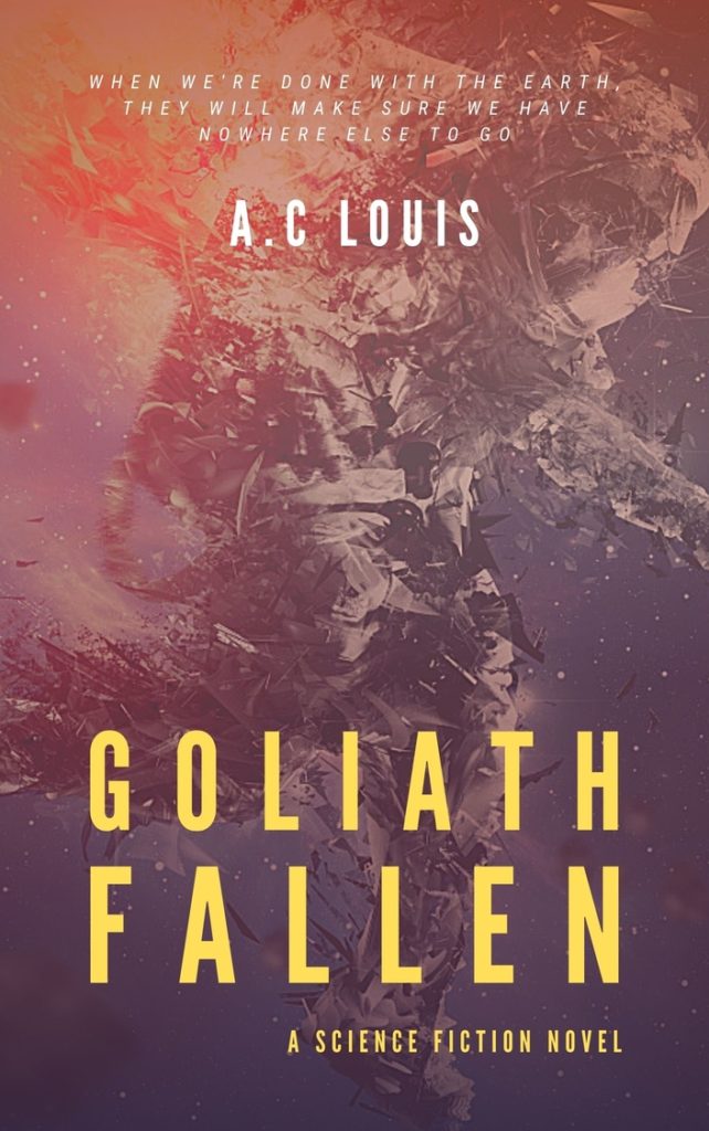
My first idea was to design something along the lines of my original cover. In my humble opinion, it does a good job capturing the mood of my story: isolation, destruction, and chaos. However, given that I had a professional now, I was open to taking the design in a completely different direction. At this stage, designing something similar to the original cover would be a fruitless endeavor. I wanted to see what was possible to really have GOLIATH FALLEN stand out on the shelves.
My second idea for the design was motivated by feedback from my beta readers. They often commented that their favorite character from my book was Izzy Clarke, a tenacious 12-year-old girl who dwells with her father in the wreckage of the starship Goliath. At the beginning of the second act, Izzy confronts a howler, a vicious alien creature resembling a tailed reptilian bull. In imagining that scene, I always pictured something akin to the “Fearless Girl” and “Charging Bull” sculptures near New York’s Wall Street. For the cover, I thought it would be a great visual to have Izzy and the howler standing off in a similar fashion with the post-apocalyptic interior of the Goliath in the background.

When I presented both ideas to Alejandro, he advised that we go with the second one since it’ll allow us to showcase the characters more effectively. At this stage, we were just starting preliminary discussions before Alejandro got to work on the cover a month later (at my request).
Sketching the general direction of the book cover design
Once we settled on a general direction, I decided to develop a very rough sketch to ensure Alejandro and I had a complete mutual agreement on the path we were taking with the design. I found it important to set this creative direction upfront because Alejandro’s design wouldn’t comprise a composition of stock assets or images but a digital collage mixing photos, textures, and digital painting. All this to say that if changes were required once the artwork was done, he would have to redo the entire thing (or at least a good portion of it).
In retrospect, I ended up completely overdoing the sketch. I added the elements that I considered to be central to the story: the main characters, the creatures, and the setting. In the foreground, we have Izzy confronting not one but two howlers (like the actual scene in the book). There’s fire and rubble on the sides and behind the silhouettes of lurkers, which are zombie-like creatures. Finally, in the background, we have a classic floating-heads arrangement featuring the three main characters: Izzy, her father, Nate, and scientist Lucas Sundberg all in spacesuits for some reason.
While Alejandro will ultimately be the creative director, these characters, creatures, setting, and other story elements are described in a certain way in the book that the final cover design will have to follow. For this reason, in addition to the sketch, I wrote a brief containing descriptions and reference images. I uploaded everything to Reedsy and sent it over to him for comment. All along, I felt like maybe I was getting too much in the way of his creative process. I didn’t want to stifle him. However, once he replied, I was pleasantly surprised by how receptive he was.
Refining the book cover design
A professional artist with tons of experience doesn’t only provide you with a high-quality book cover. They can also chisel your vision into something that can truly succeed in the market. Alejandro has designed stunning covers for dozens of successful books. Naturally, he knows this industry far better than I do. His verdict on my sketch was that it was too busy and looked like a cliché movie poster. He is very polite and professional, so he didn’t exactly use those words, but, in essence, that was his feedback. And, honestly, I couldn’t agree more.
Amongst a dozen other things, I had forgotten to leave space for the book title. And also, the subtitle, and my own name as the author. It would appear to me (and anyone half awake) that these are crucial elements in a book cover. With my sketch, if we added any lettering at the top, it would have covered the background characters entirely. What was I thinking?
Alejandro ended up suggesting a more simplified composition with only Izzy facing the howler. The scene itself is pretty powerful already and far more intriguing than a bunch of floating heads. This would also be easier on the viewer’s eyes and leave plenty of room to play with lettering.
The book cover design reveal (and iterations)
Once we visually committed to the direction, it was time for Alejandro to start the hard work of illustrating the book cover design. At this stage, my anxiety was certainly getting the best of me. I was confident in Alejandro and his incredible skills, but I’d been working on this book for six long years, and this was a big moment. On top of all that, Alejandro would have the cover ready in just one week. One week! My gosh… stopping to catch a breath is not an option in the self-publishing world.
First iteration
As expected, the following week flew by. Before I knew it, I had Alejandro back in my inbox with the first iteration of my book’s cover design. I had just woken up (Alejandro is seven hours ahead of me), and Reedsy’s notification shot my heart rate up to a thousand. I couldn’t bring myself to open the attached image until later in the day since I needed time to mentally prepare myself for this moment. But, at last, when I gathered the courage, I was finally able to fathom the true magnitude of Alejandro’s talent.
I simply cannot describe what I felt when I first saw this book cover design (which doesn’t speak too well of me as a writer but bear with me here). It was as if Alejandro had reached into my brain and pulled Izzy out of it and put her on the page. Also, he was absolutely right; having only the scene of Izzy facing the creature makes the visual come alive. It’s a more sound, well-balanced, and provocative design.
After getting over the initial shock, I did the same thing I always do with a completed manuscript: I put the cover away for a bit with the intention to revisit it later with a cooler head. That way, I would see it with a fresh perspective.
The next day, I gave the cover a closer inspection. I noticed a few minor details that needed some work, like the title font being a bit too thin and Izzy missing her characteristic backpack. But, what worried me the most was the creature design; it wasn’t accurate to how they’re described in the book. Howlers are similar to the screaming bear from Annihilation but more muscular and thinner for faster movement. My anxiety kicked back in just at the thought of Alejandro having to redraw the creature. I felt like that annoying customer (and no one wants to be that guy).
Anyway, if I was going to ask Alejandro to rework the cover, I would do my best to communicate the changes to avoid giving him more work than necessary. In the end, it’s a collaboration. The easier I make his job, the better the final product will be and the more it will align closer to my vision. And so, I took the liberty to annotate his cover.
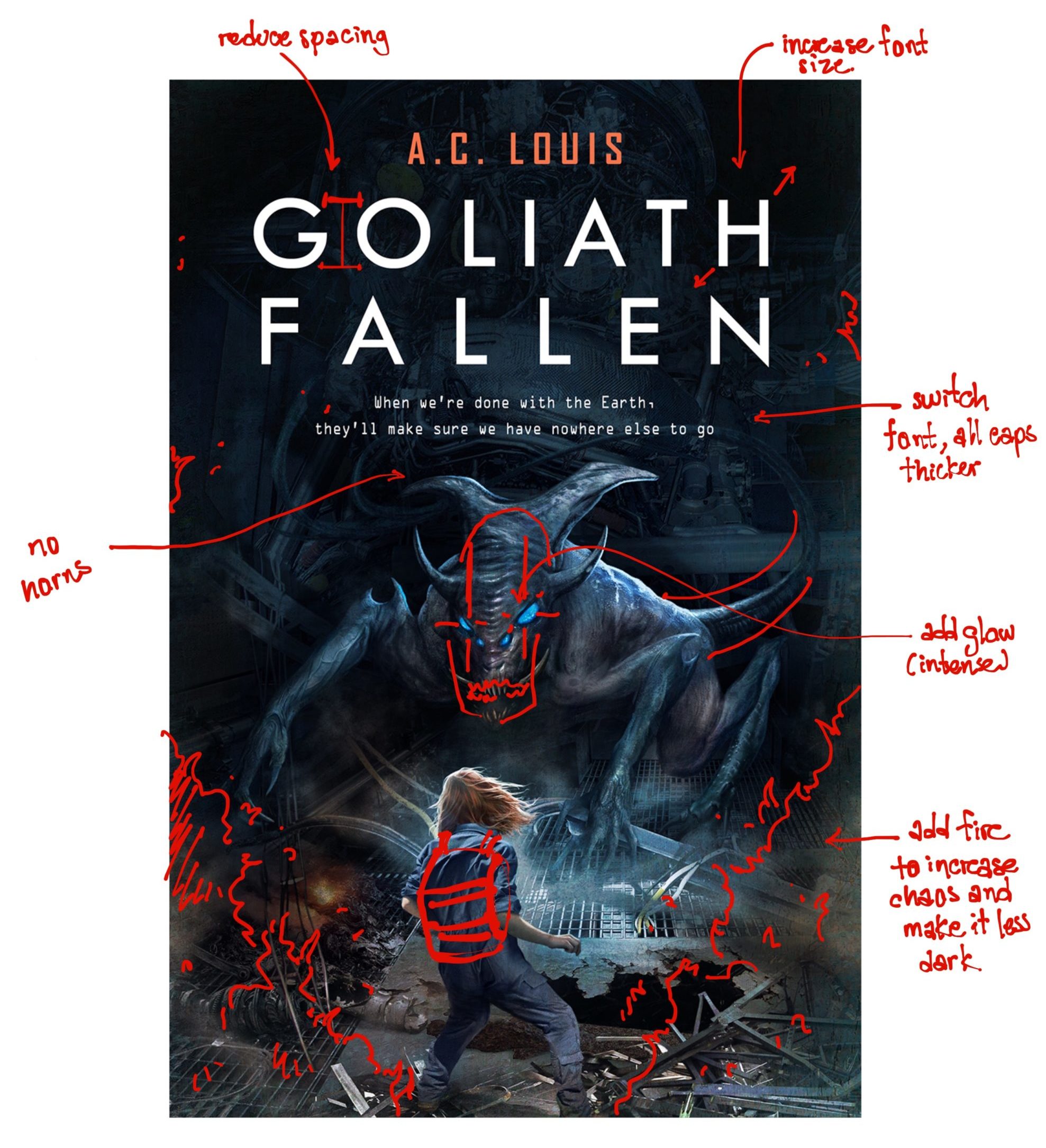
In my response to Alejandro, I detailed the requested changes to the creature as thoroughly as I could. Feeling like the most annoying person in the world, I uploaded everything and hit send.
He answered the next day, leaving me once again speechless with how receptive he was. We discussed the creature design and the requested changes a bit more, and he asked for a few additional days to complete the new design. That level of quality was worth waiting for. He could have taken the whole month for all I cared.
Second iteration
About a week went by before Alejandro returned an updated design. For me, it felt like two days at most—he works fast, and I couldn’t even bear it. Again, I needed to take a few hours before viewing the new design. If I was stoked with the first version, this new one had me twice as pumped.
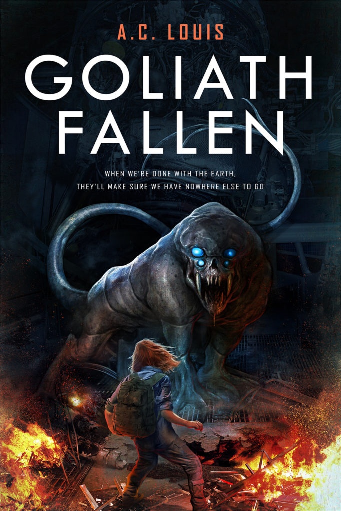
From my perspective, the addition of the fire in this new design benefited the overall composition by revving up the sense of urgency. It also helped better orient the viewer’s attention. With the lower portion now more striking, Izzy becomes the primary focus. We then have the title and, lastly, the creature. Izzy’s backpack is also in there, which is the reason she’s facing that creature in the first place. In the novel, she goes out on a supply run where she found it and gets ambushed by howlers.
As for the lettering, the book title now looks more robust, and the subtitle font complements the visual theme better. The overall design looks more “sci-fi”. Before we started the project, Alejandro pointed out that although his specialty was fantasy covers, he would try his best to design a sci-fi one. However, one of the main reasons I picked him for this job is that my book is full of creatures and other “fantastical” sci-fi elements, so I needed someone with experience rendering such onto a canvas.
At last, we have the howler in the background, now completely redesigned. I had requested Alejandro to leave the long tail, make the eyes brighter, and change the body from something resembling an insect to a more bull-like creature. However, while I was as stoked for this book cover design as ever, something still didn’t feel right. The howler’s face was perfect, but its posture and body type still didn’t resemble my idea of a howler. For starters, they’re not as bulky. They’re huge and heavy but also sneaky, prowling in the darkness around their victims. The rest of the cover was perfect, but the creature still needed work.
I realized I would have to request that Alejandro make additional changes, and the dread started to consume my soul. In any case, my intention was to reach out to him, and if redoing the howler was too much work, then I would at least have this incredible cover that I could easily use. Like the last time, I annotated the cover design instead of just bombarding him with a list of changes. After all, that approach had worked well before.
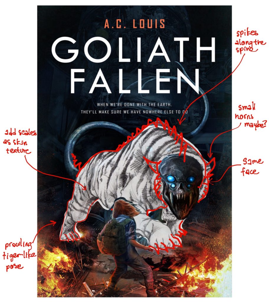
Once again, I felt like I was seizing creative control, but there wasn’t really a way around it as my howlers have a very specific look. I had to make my vision clear. I also thought that a prowling lion pose would make the creature appear more menacing. If I had to pick an iconic scene from my book, this would be it! I wanted the cover to accurately bring it to life.
And so, while Alejandro expressed that redrawing the creature was a great deal of work, he was committed to full customer satisfaction. At this point, it felt more like he was challenging himself to nail down the howler design. Without further comment, he receded back into his studio to redo the cover. This man seriously is a godsend. For my first time working with a freelancer, this has been an exceedingly satisfying experience. I was confident in Alejandro’s skills and that the next iteration would be perfect.
Third (and final) iteration
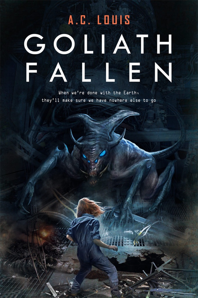
Alejandro’s next delivery was my definition of perfection. I honestly have no words to this day to describe how impressed I am with this cover. All I can say is that a big smile drew on my silly face when I first laid eyes on it. Take a look for yourself at Goliath Fallen’s third and final cover:
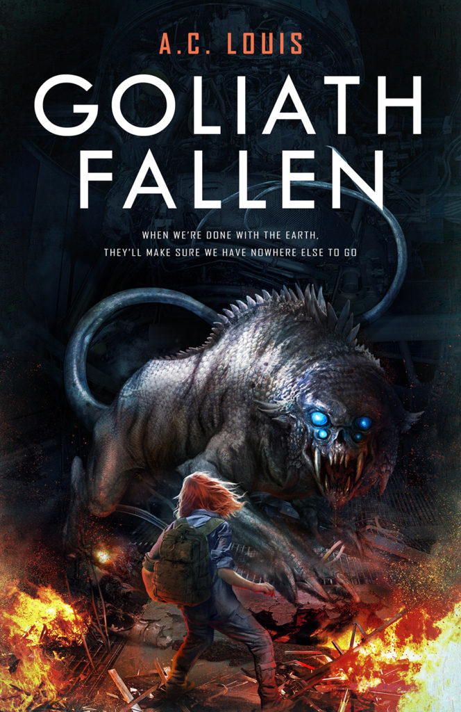
One word comes to mind when I see this version of the howler: menacing. The long tail, the scaled skin, the heavy but nimble-looking body, the terrifying four-eyed face with blood dripping down a mouth full of fangs—this is exactly what howlers look like. How the heck will Izzy be able to get out of this? That’s precisely the question I want to evoke in the readers’ minds.
Just looking at this cover, I completely forgot about how much it cost. I was extremely satisfied, and, moreover, I was glad to know that Alejandro was as well. I’ll just quote him here:
This is one of my favourite sci fi book covers I made this year, by the way.
I felt terrible about making him redo the cover so many times, but this comment reassured me. We were a team, and we both needed to be satisfied with the end product. That’s an important takeaway I got from all of this (aside from a kickass cover I can’t wait to use everywhere).
Final thoughts
Designing the book cover for my debut novel, GOLIATH FALLEN, has been one of the most exciting experiences I’ve had to date. Just imagining my book sitting there on shelves with this incredible cover sends chills down my spine. I was incredibly lucky to get to work with somebody as talented, professional, and committed as Alejandro Colucci. I can’t thank him enough for all his hard work and endless patience. Hopefully, this humble piece serves as a special, very well-deserved “thank you.”
As a final note, if you’re looking for an incredible designer to bring your fantasy or sci-fi book cover to life, don’t hesitate to reach Alejandro over on Reedsy or on his website. Let my new, blazing-hot cover be a testimony to his endless talent. If anything, Alejandro has left the bar impossibly high, and I can’t imagine myself working with anybody else for future writing projects.
I hope you enjoyed reading through the process of working with a freelancer to design my book cover. For me, finding the right designer to work with was imperative, and I’d be curious to know if any other authors out there found that to be true as well. Let me know in the comments below. I’d also love to hear your thoughts on the new book cover design too. And, as always, if you have any specific questions, please feel free to reach out.
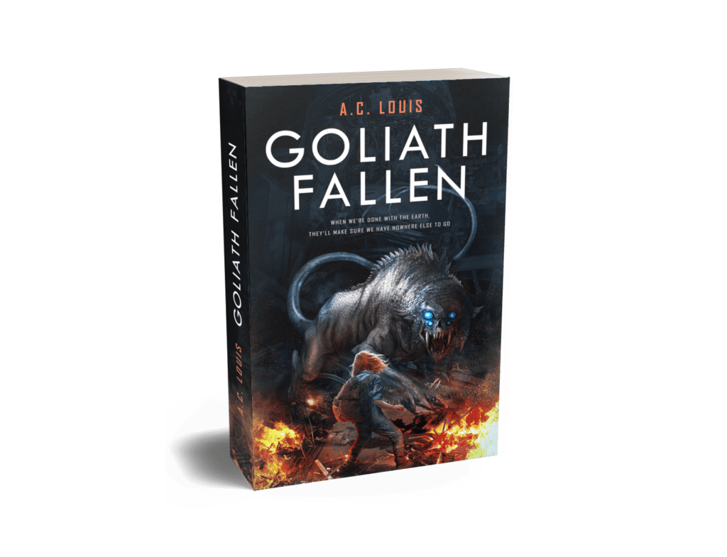
Before we part, I’ll leave you with a rendering of how Goliath Fallen’s paperback will appear in its full form. I’m giddy with excitement over it, and I just can’t not share it!
Get Two Books for Free
Get a preview of my sci-fi thriller, Goliath Fallen, by joining my exclusive mailing list for access to sales and giveaways. And don’t worry, I dislike spam as much as you do so don’t expect any from me. You can unsubscribe at any time.